Goshen Public Library
Redefining a Community Staple with Curious Exuberance
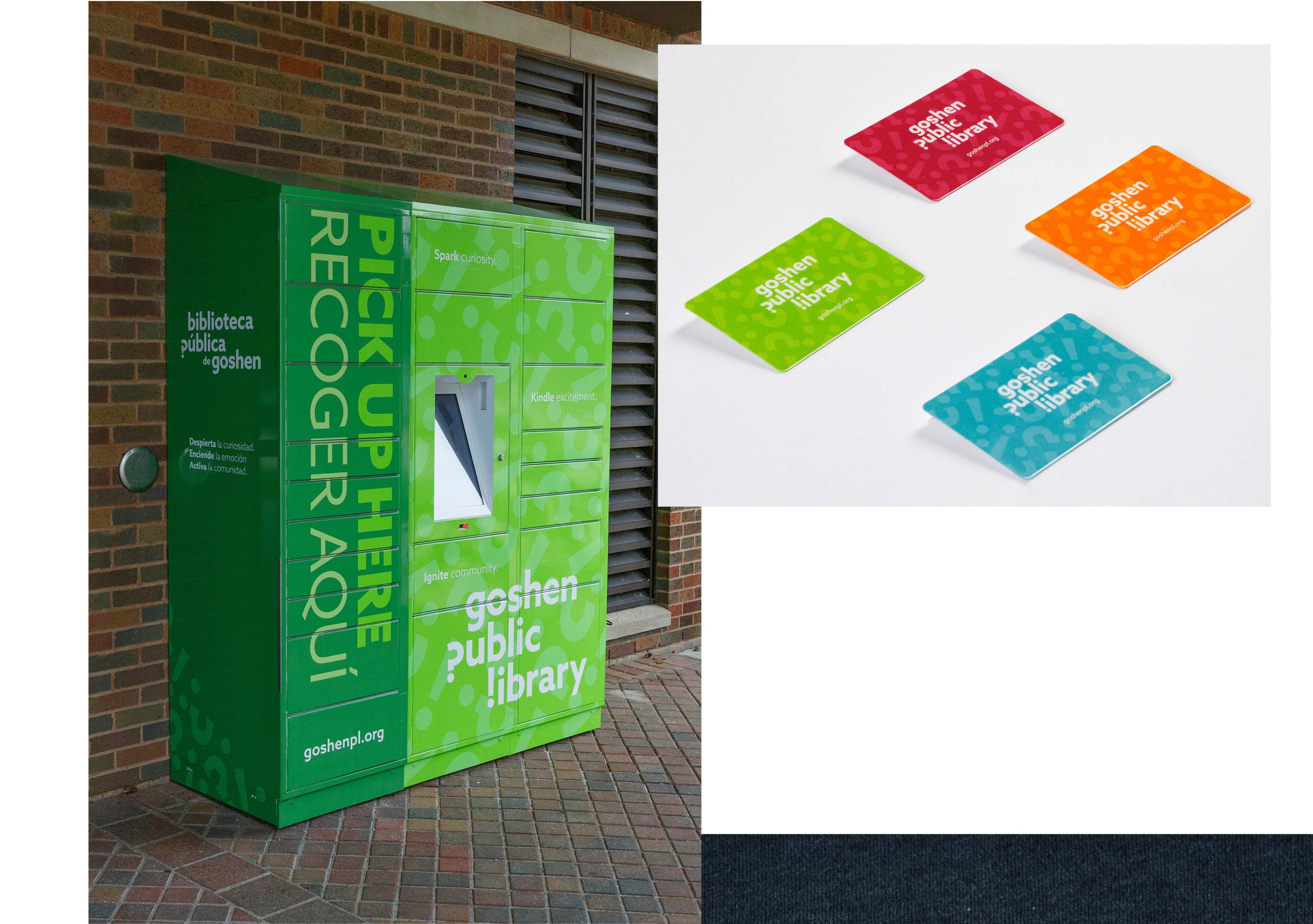
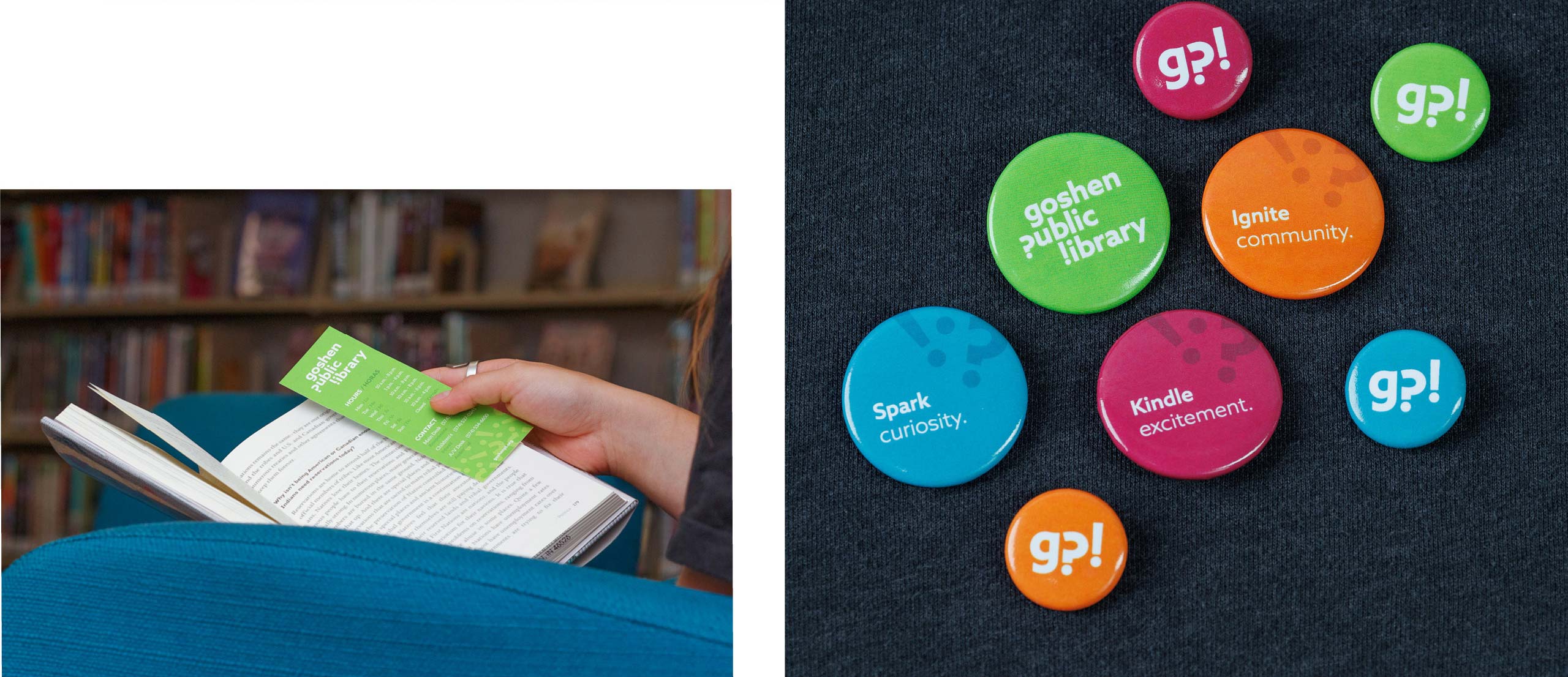
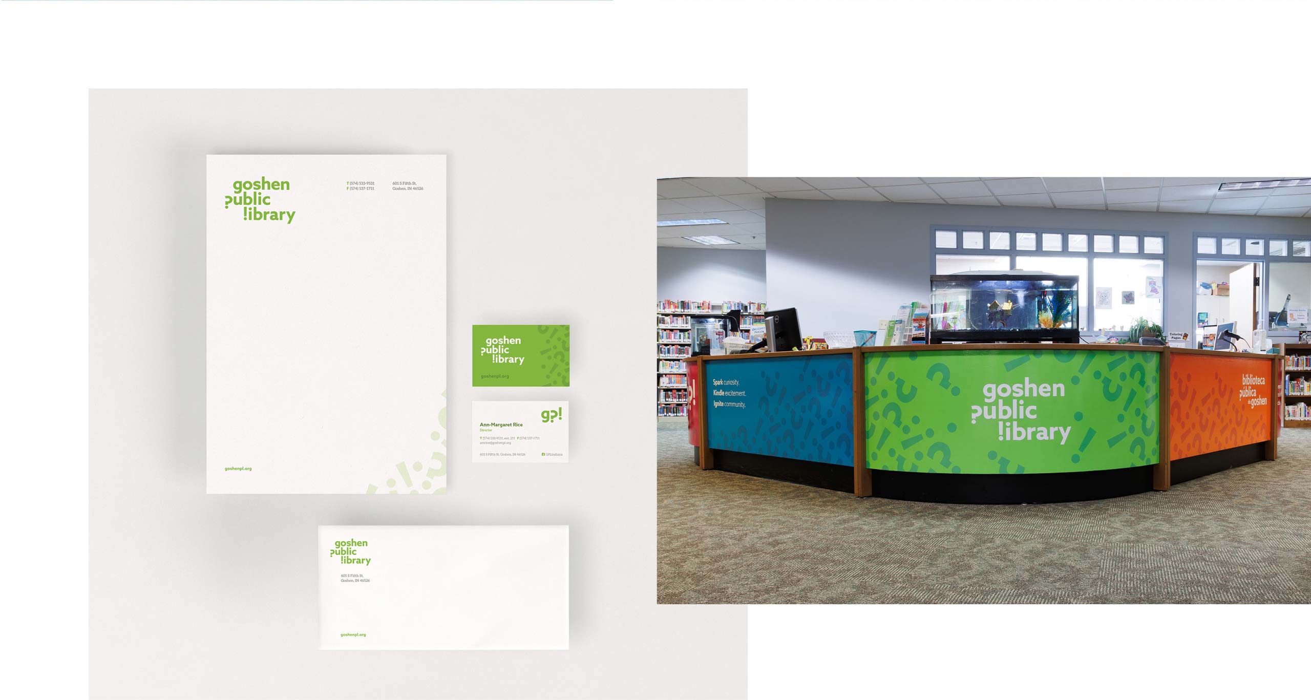
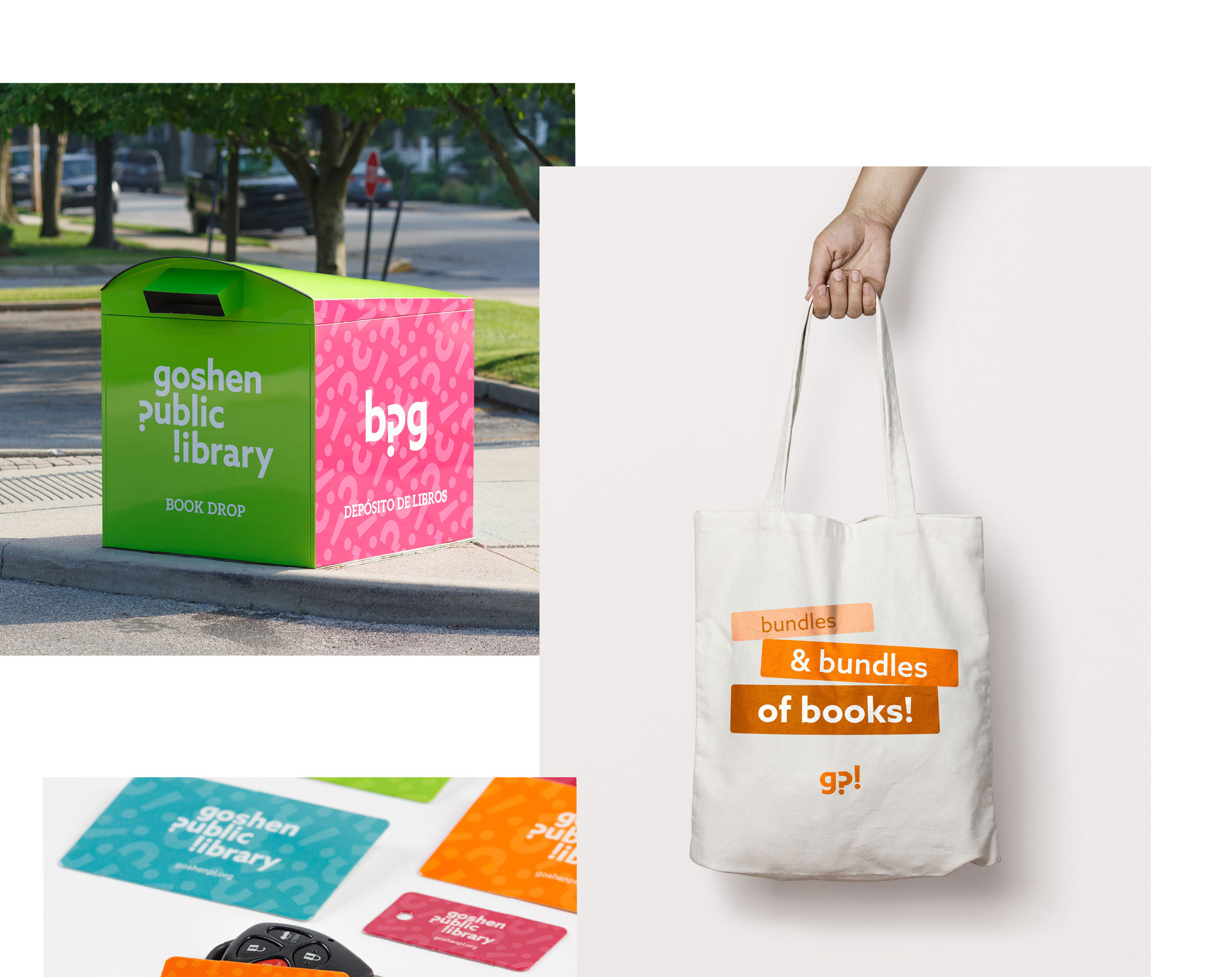
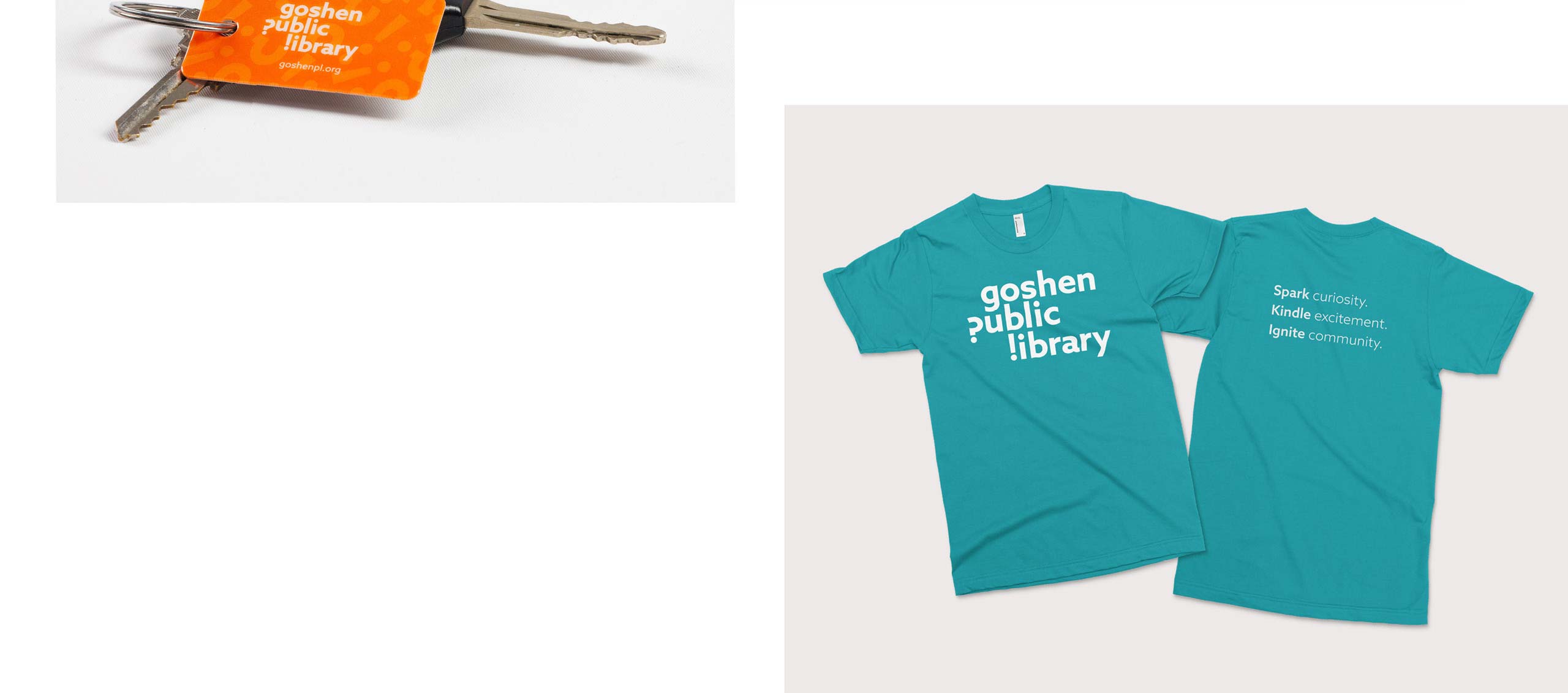
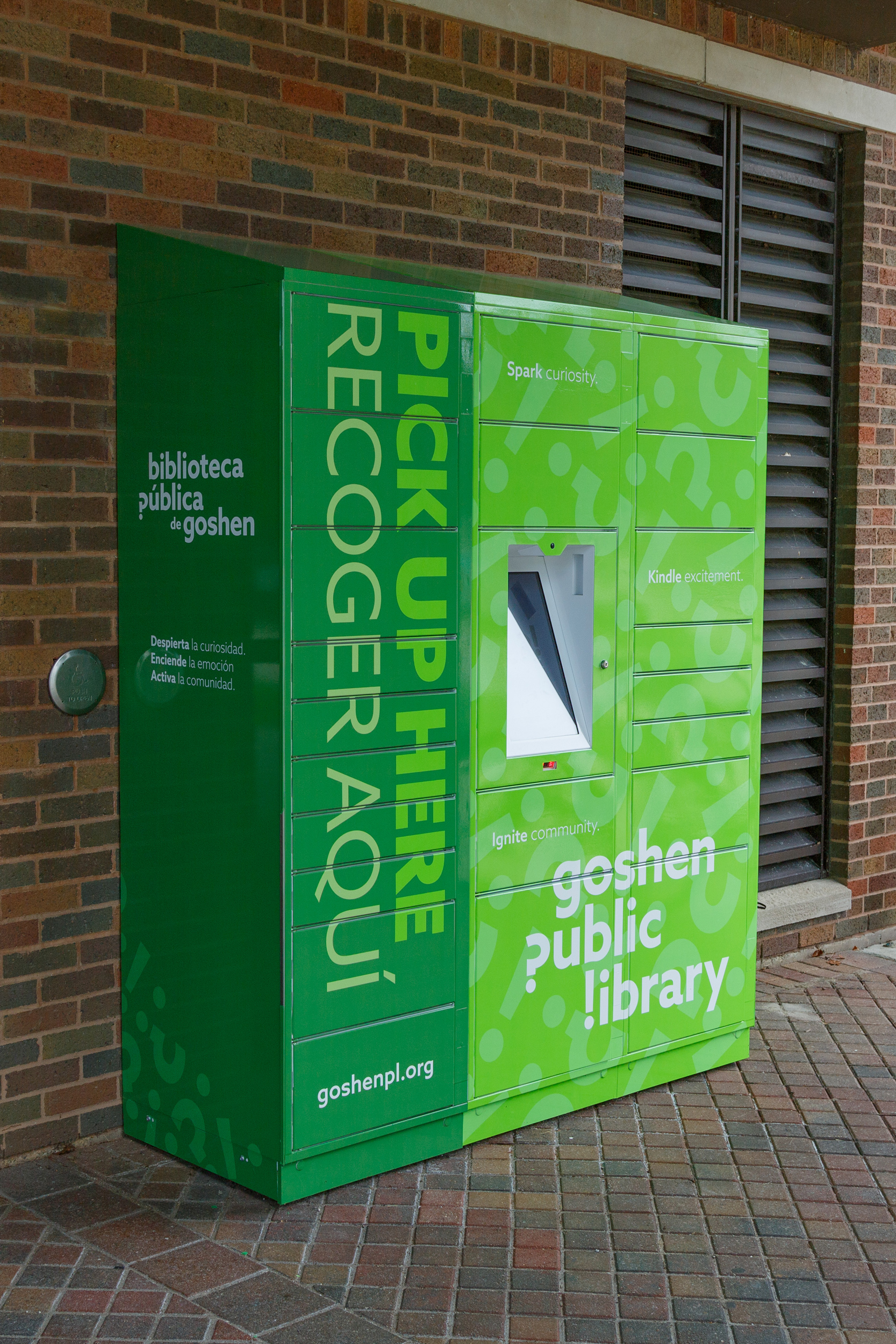
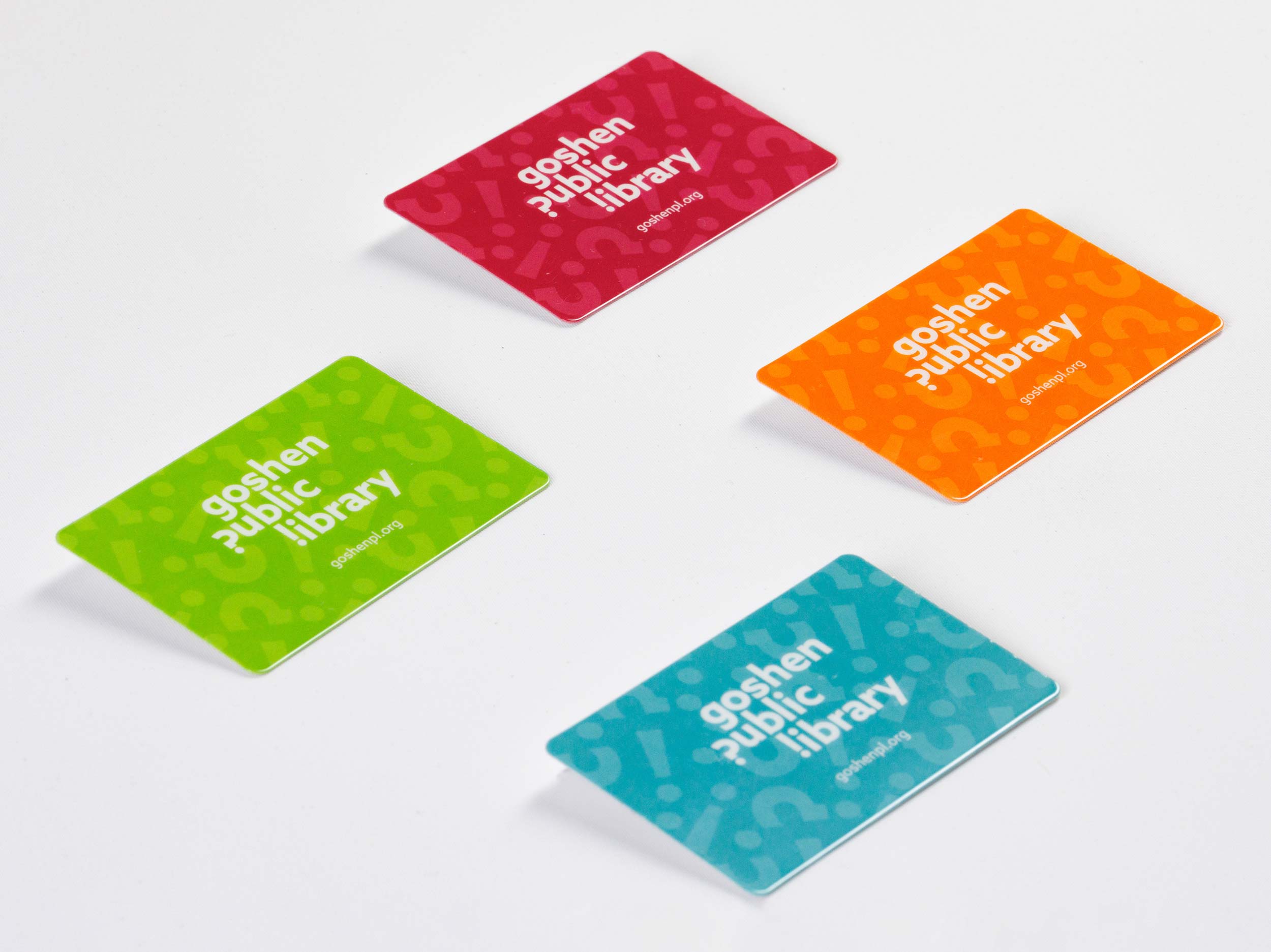
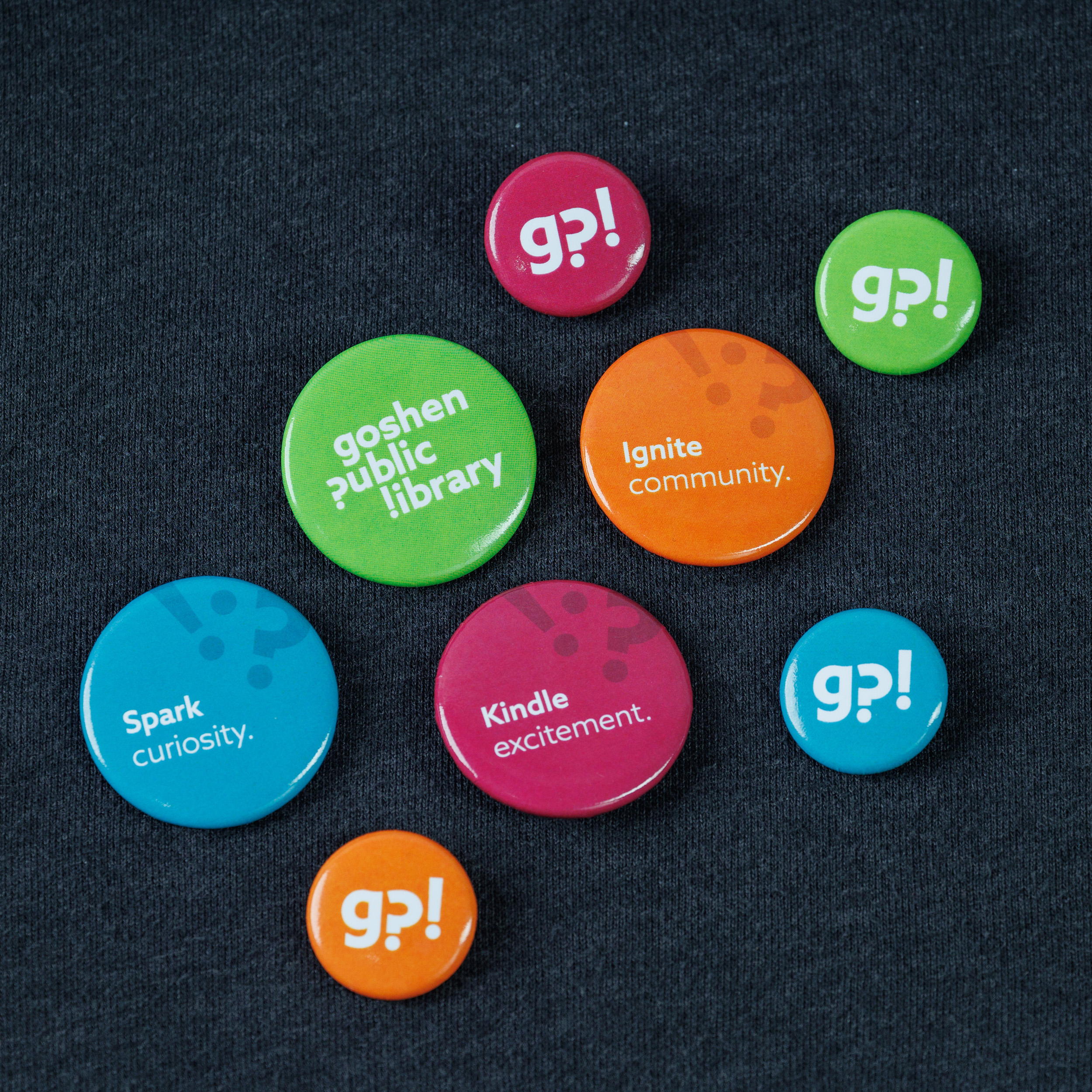
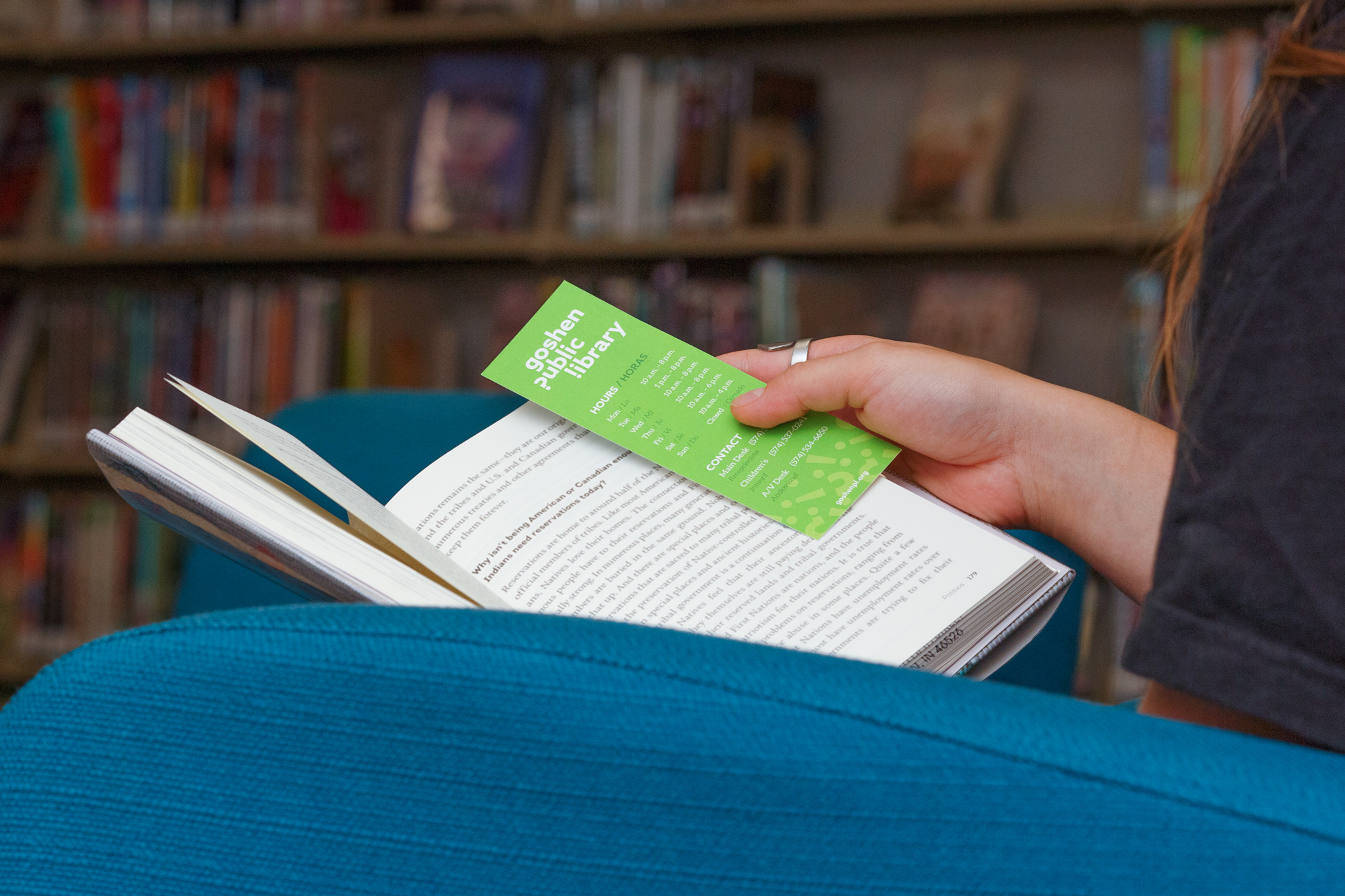
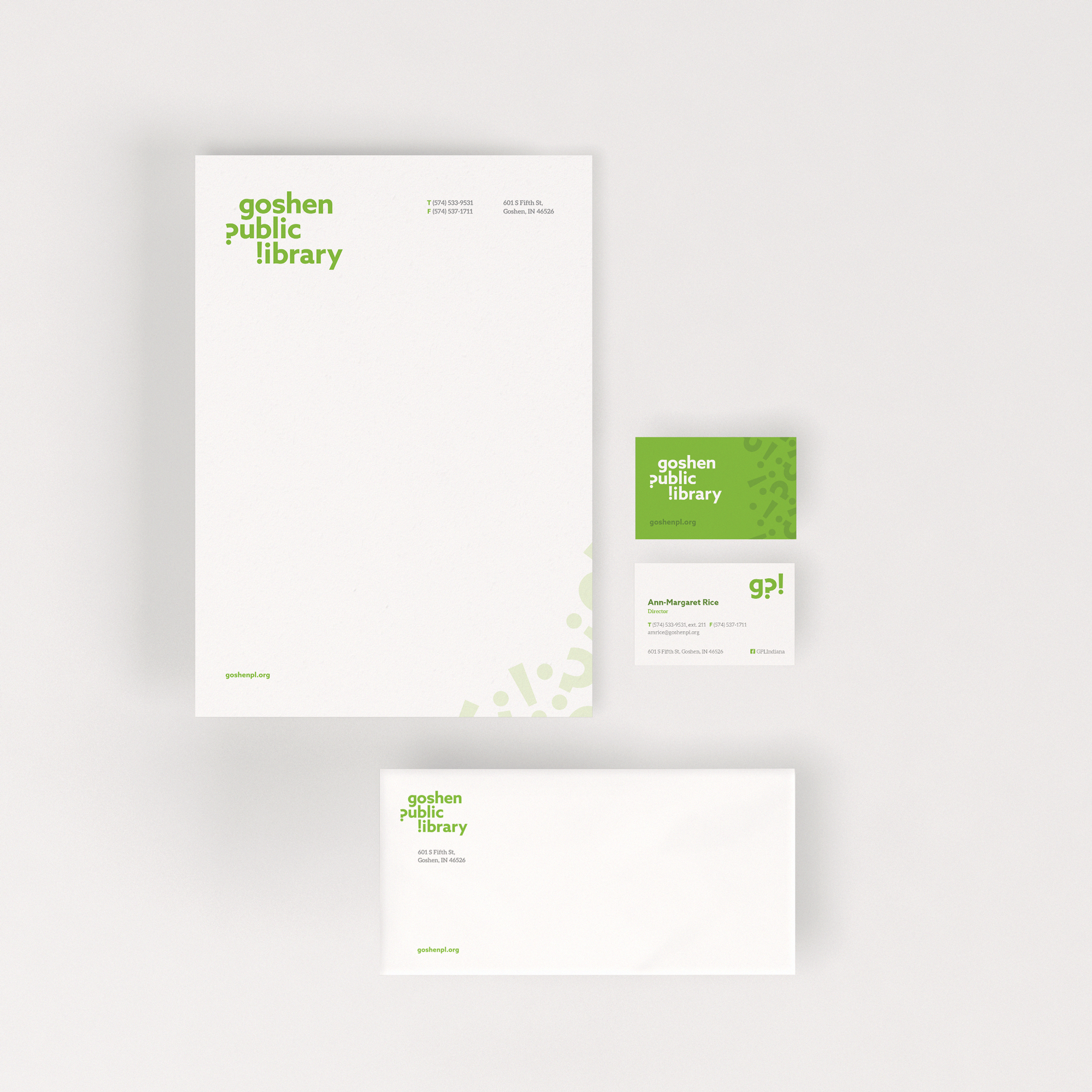
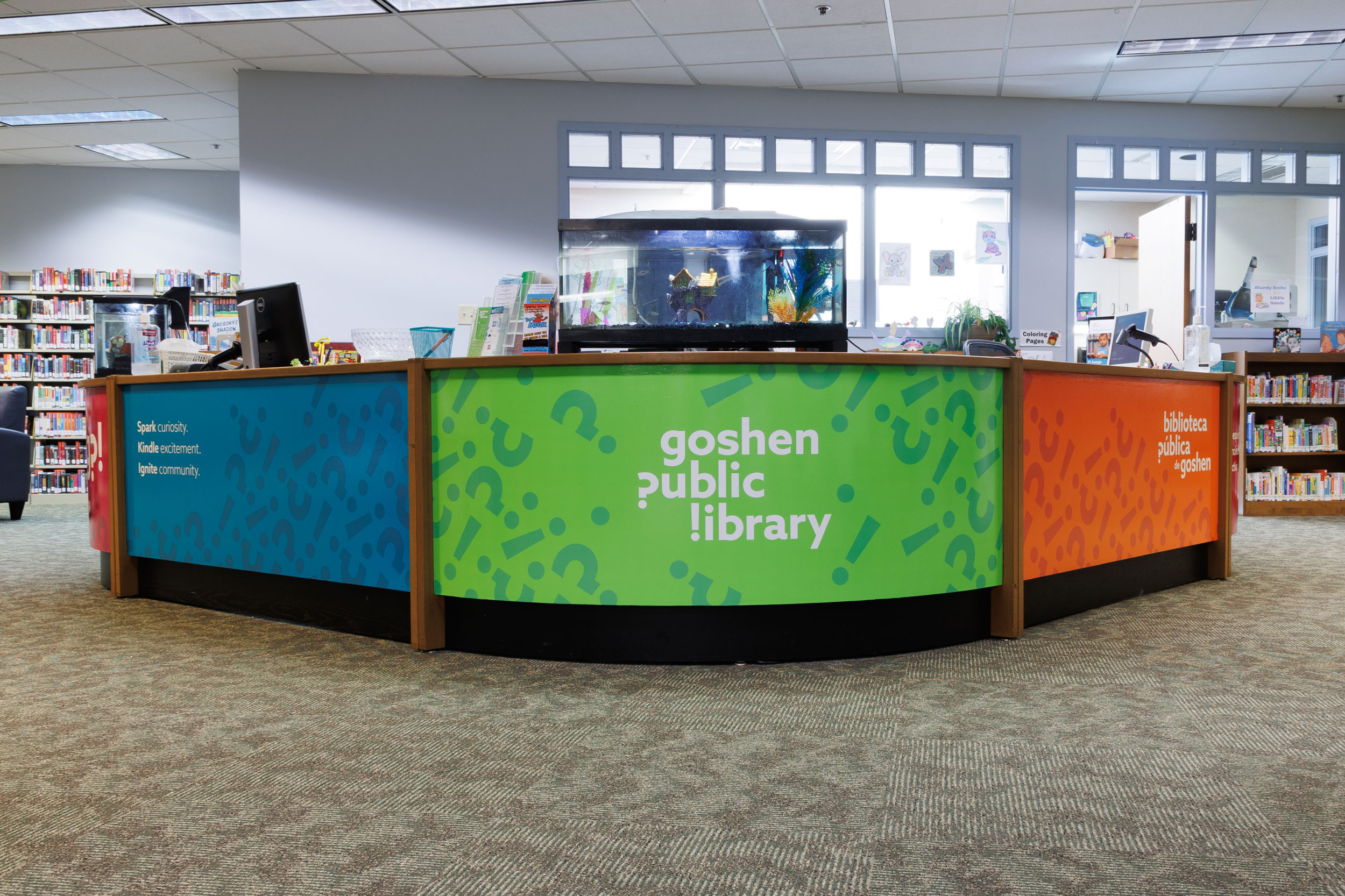
Our studio was engaged to brand the library following their strategic plan formulated the year before. The subsequent long-range plan contained a new mission and vision. From the the mission, we drew the importance of enrichment, community and lifelong learning. The vision contained a wonderful opportunity to explore the kinetic nature of a vibrant 21st century library. Community engagement and a love of learning were prominent in both.
Mission
We enrich lives, create connections, provide equitable accessibility, cultivate community partnerships, nurture reading, and champion education and lifelong learning.
Vision
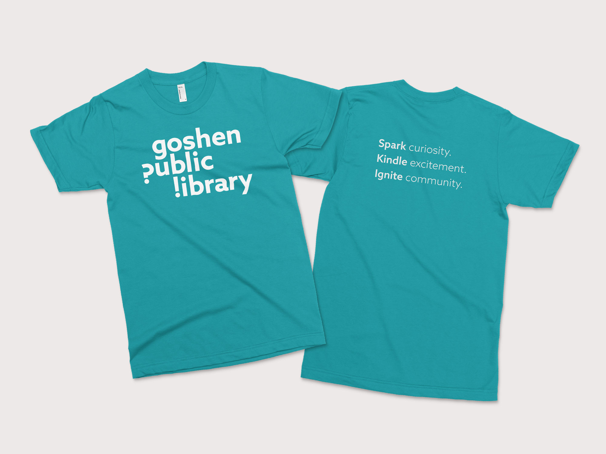
We kindle educational curiosities, spark connections in the community, and ignite a lifelong love of learning.
Services
- Identity Design
- Visual Communication Design
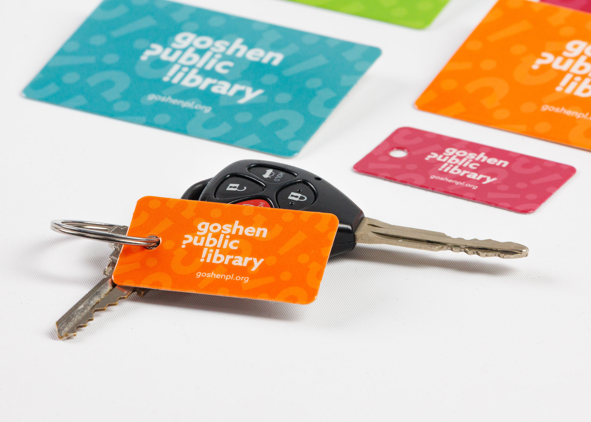
- Branding
- Motion Design
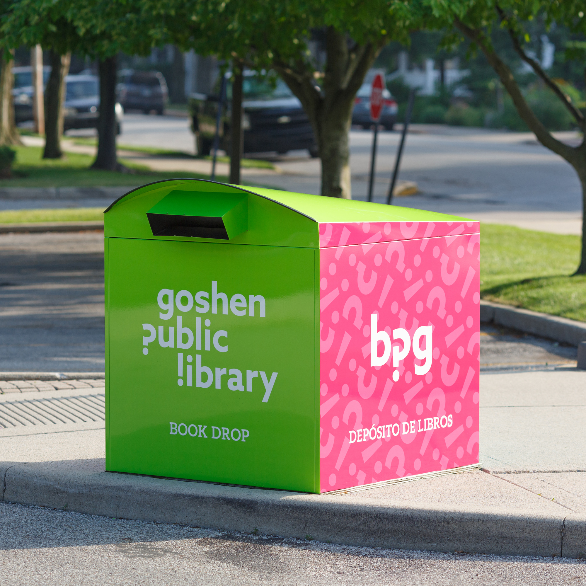
- Signage + Wayfinding
- Photography
CLIENT
- Goshen Public Library
CLIENT
- Goshen Public Library
Services
- Identity Design
- Visual Communication Design
- Branding
- Motion Design
- Signage + Wayfinding
- Photography
Goals
Early brandmark explorations
GPL kids and teens Sub brand
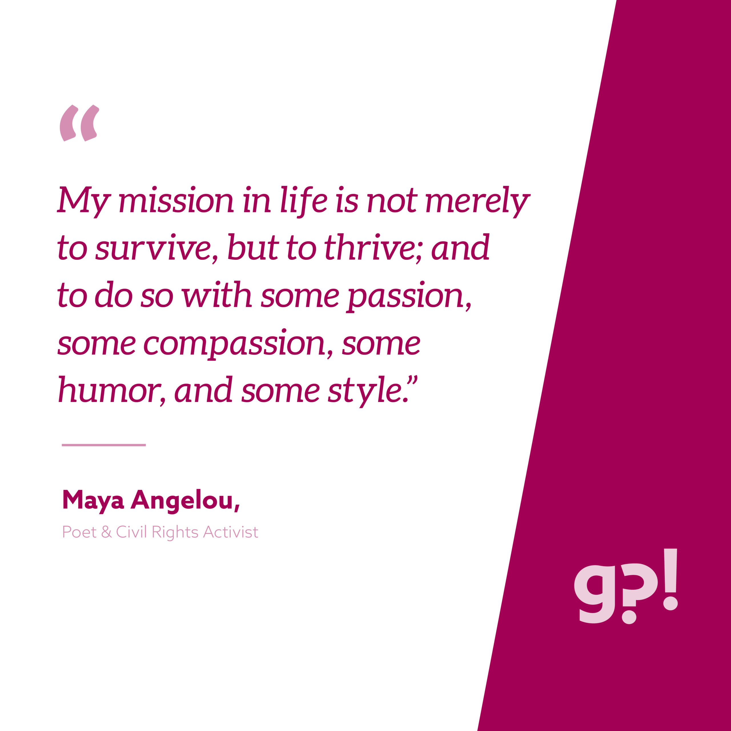
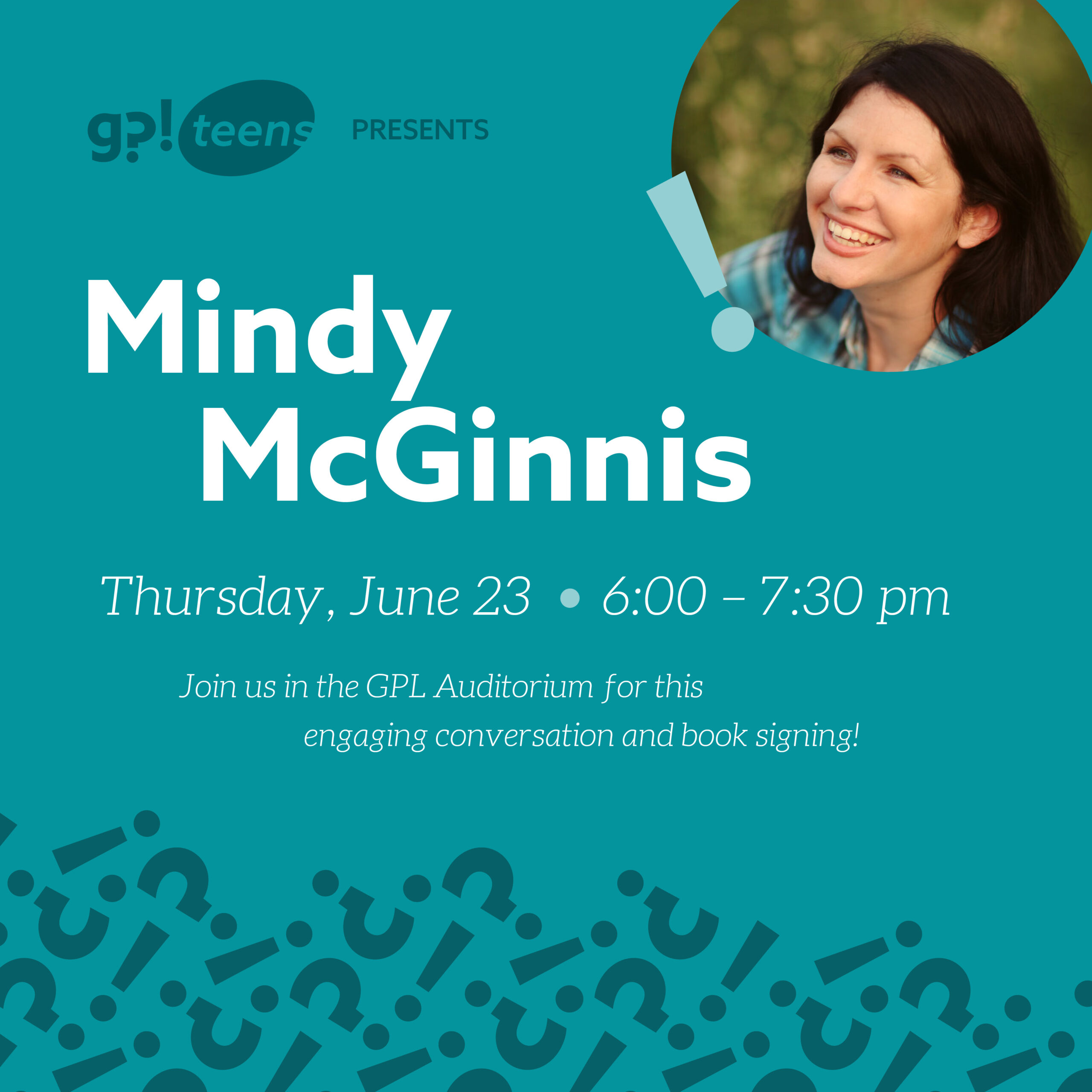
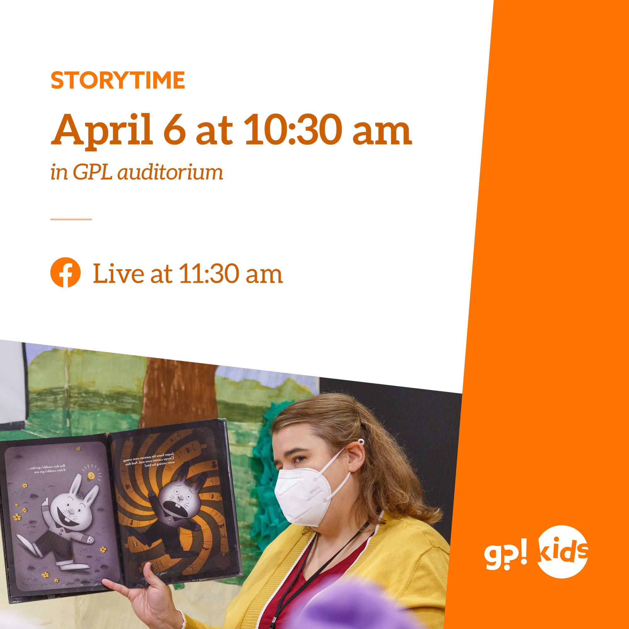
Social Media Content

Jordan, Raf, and the rest of the LightBox team were a joy to work with! They inherently understood the mission of the library and our desired place within our community. They were always professional, incredibly talented and creative, and very responsive. Best of all they made our work together fun and something we always looked forward to. They were wonderful advocates for the work we do at GPL and we believe they are among the brightest assets of Goshen!
Ann-Margaret Rice, Director
Outcomes
The Library’s new brand helps to communicate the library’s vision of being a place of curiosity, excitement, and of deep community engagement. Goshen Public Library is more than a place for books. It is a key community institution for catalyzing Elkhart Township’s vision to become a more vibrant, welcoming, and informed community. It is a space, collection, and community that is at its best when meeting the unique needs of all residents. To meet the full array of our community’s needs, GPL envisioned delivering the highest quality library services, and this new brand symbolizes the beginning of this new chapter in their community story.
Credits
Creative & Art Direction
Rafael Barahona
Jordan Kauffman
Designers
Abby Graber
Jessica Isch
Motion Design
Jessica Isch

