Mennonite Disaster Service
Bringing Communities Together to Respond to Disaster
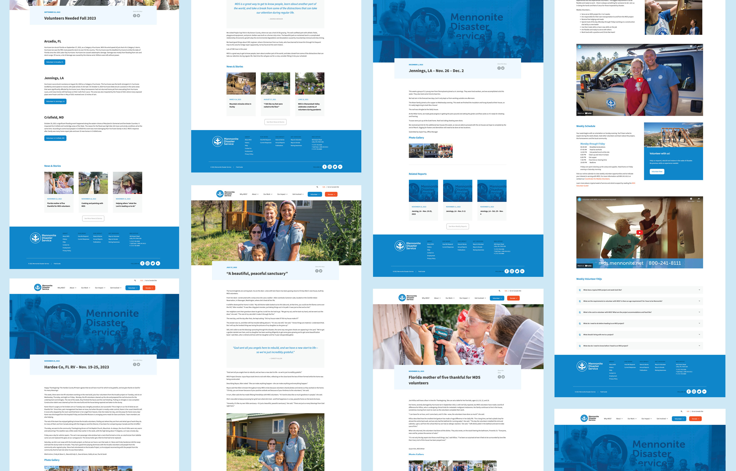
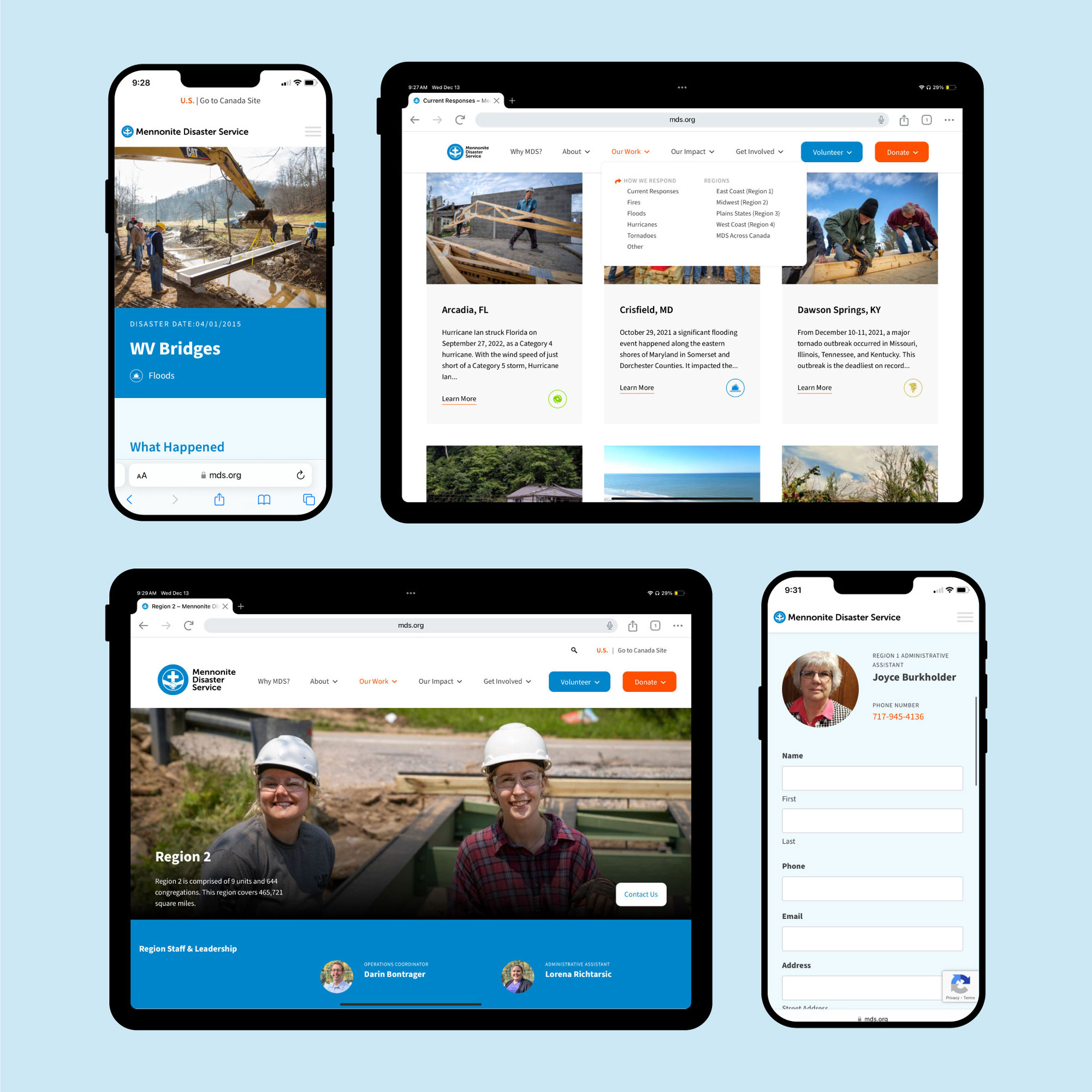
MDS approached us in need of a new responsive website to share how they are bringing communities together to respond to disasters and how people can get involved. Our solution was built upon defined user personas and their corresponding goals or actions. We also developed a custom WordPress backend experience to facilitate numerous site administrators on country, region, and local geographies. Key to the success of this new site, from an administrative standpoint, was the integration of both USA and Canadian content and experiences into one WordPress instance. Visitors to mds.org are served unique content depending on where in North America they’re located. Through these different avenues LightBox was able to help guide MDS into the latest chapter of digital storytelling and experience.
Services
- User Experience
Design - Web Development
- Social Media
CLIENT
- Mennonite Disaster Service
CLIENT
- Mennonite Disaster Service
Services
- User Experience Design
- Web Development
- Social Media
Goals
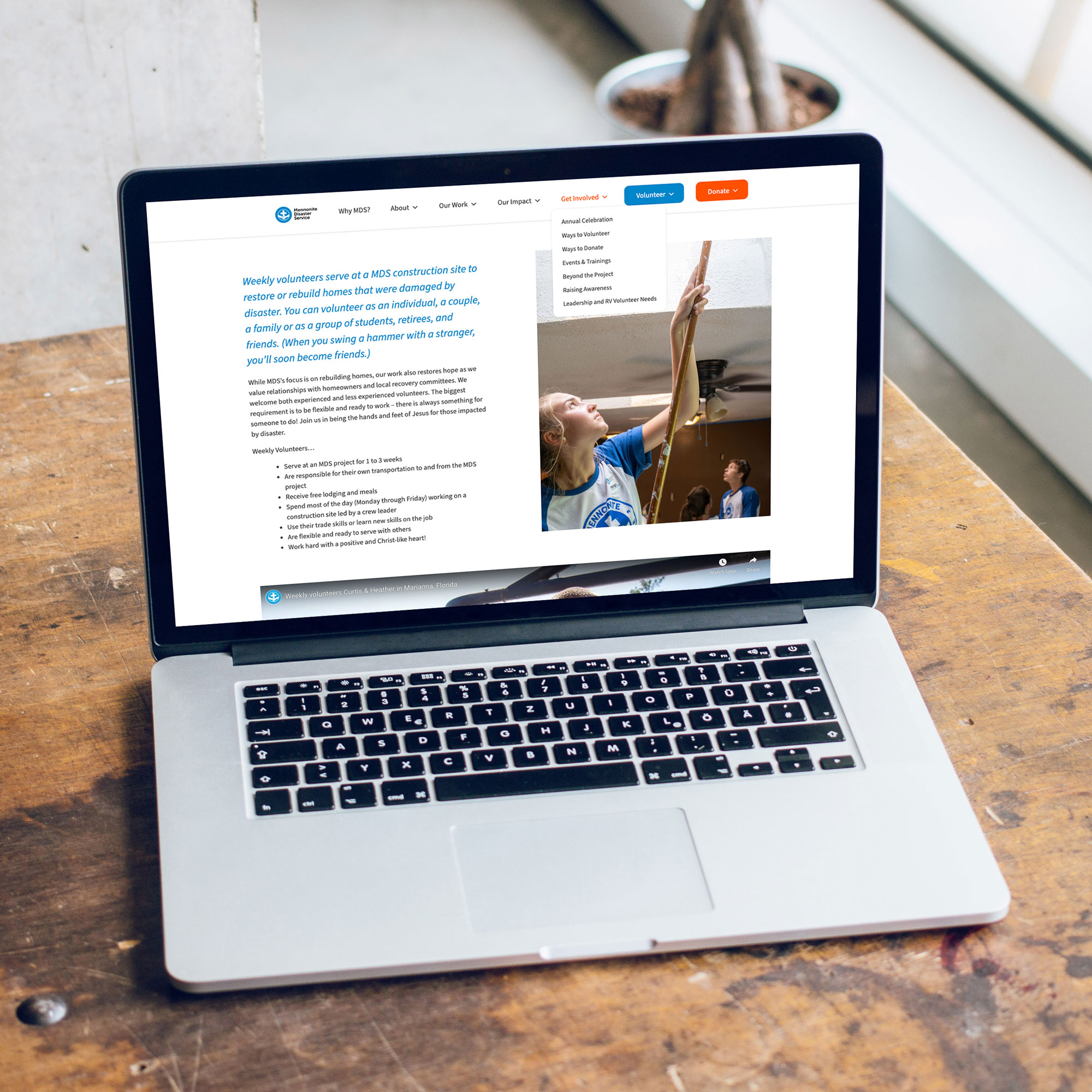
MDS had goals for both the front facing side of the site and for the backend administration. The highest priorities for the front end were to decrease the number of steps users needed to take to access the donation or volunteer portals and to create clearer donate and volunteer calls to action through out the site. This addressed need is most visibly seen in the prominence of the colored buttons in the site navigation. We have relied heavily on analytics to monitor user engagements and flows related to these changes.
On the administration side, there was a need for multiple administrators and greater segmentation of their roles and responsibilities. Furthermore, they needed to be empowered to upload content easily, and dynamically distribute different content to multiple pages based the unique MDS governance structure with units, regions, and national designations.
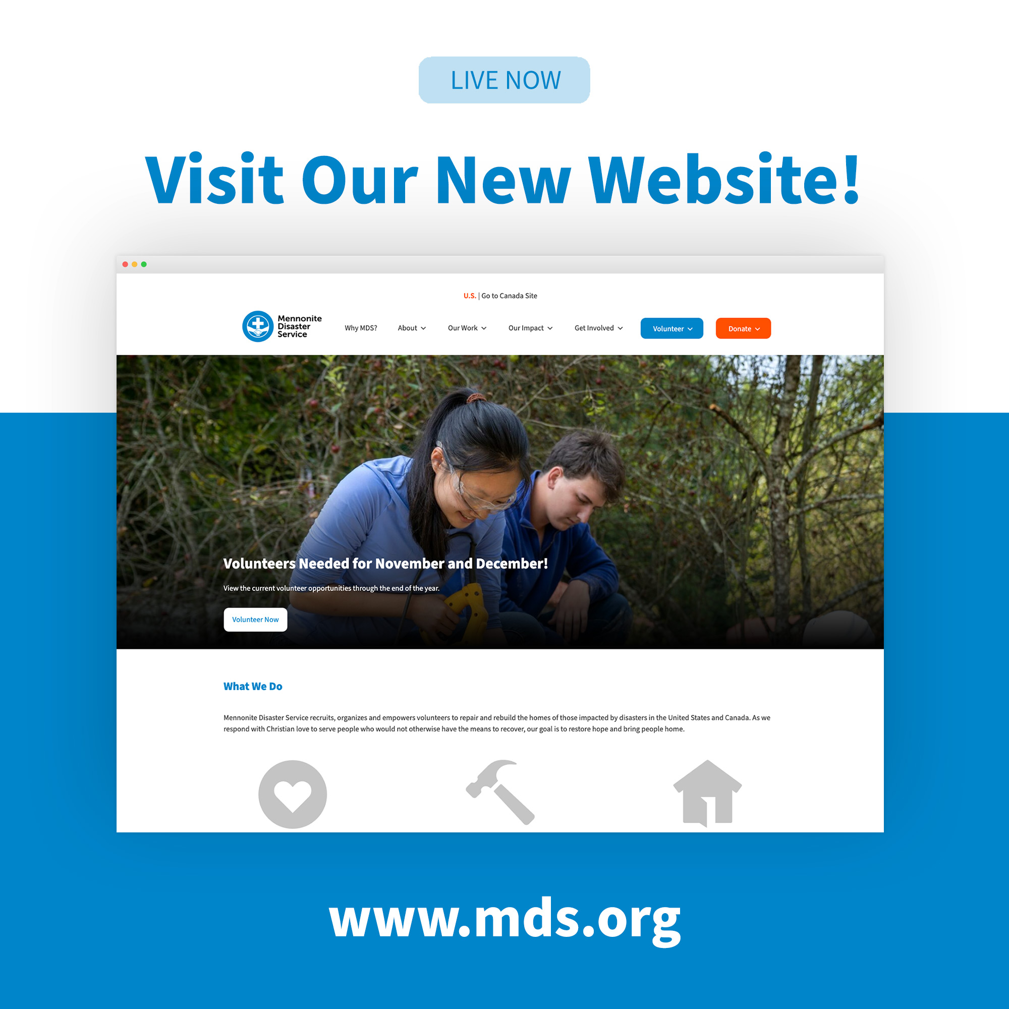
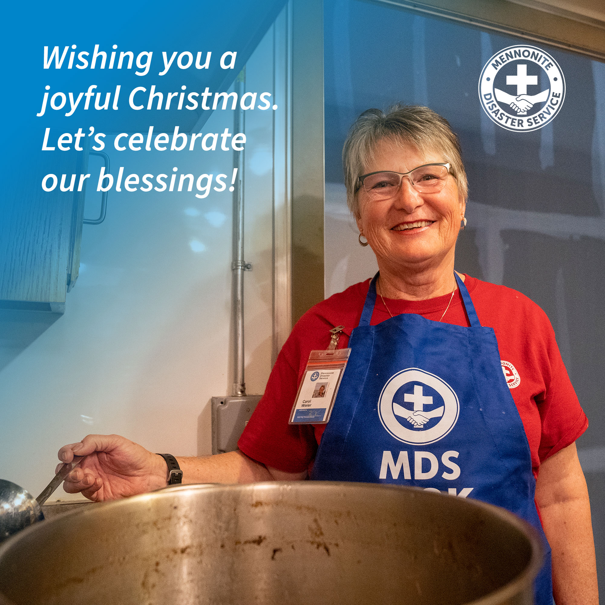
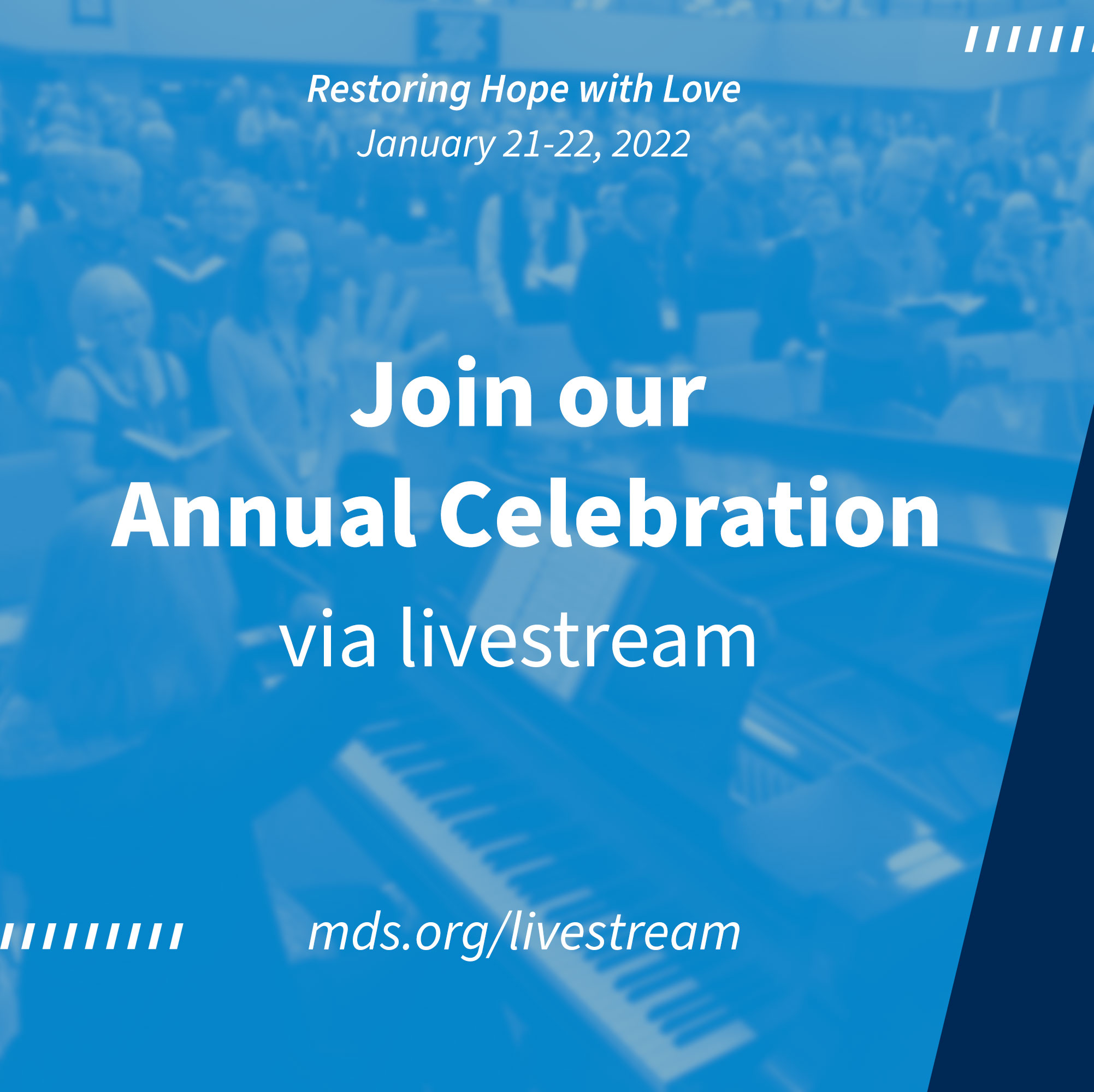
Social Media Posts
JESSE HUXMAN, COMMUNICATIONS MANAGER
Outcomes
The newly redesigned website built for MDS dramatically improved both the front end and back end user experience. As a highly engaged and active binational organization, MDS’ needs are ever-evolving. We have continued to work together, monitoring and further developing the site, addressing needs as they come up and adding a variety of new features since the 2021 launch. During the two years of working together MDS has seen a 22% increase in overall web traffic to their site.
Credits
Creative & Art Direction
Jordan Kauffman
Rafael Barahona
UI/UX Design
Abby Graber
Jordan Kauffman
Nick Yutzy
Web Development
Alex Dugger
Jordan Kauffman
Brian Sutter
