MHS Association
Refinding Roots to Help Others Blossom
MHS Association is a not-for-profit organization that supports Anabaptist faith-grounded health and human service providers in their leadership and strategic direction. In 2019, the organization committed to the future goal of developing a clear and defined identity. Using that foundational work, LightBox lead the way in a rebranding and renaming effort that aimed to better articulate the complexity of the organization. Initially founded as “Mennonite Health Services”, the organization started in mental health. Over time, they developed a member structure and were renamed “MHS Alliance”, but also were commonly referred to as MHS. During this period, the also began offering fee based services via their subsidiary, MHS Consulting. Ultimately, there was a lot of confusion around who they were and what they did, not even considering another regional organization that also shared the MHS moniker.
Services
-
Identity Design
-
Visual Communication Design
-
Branding
-
Web Design
-
Motion Design
-
Photography
CLIENT
- MHS Association
CLIENT
- MHS Association
Services
-
Identity Design
-
Visual Communication Design
-
Branding
-
Web Design
-
Motion Design
-
Photography
Goals
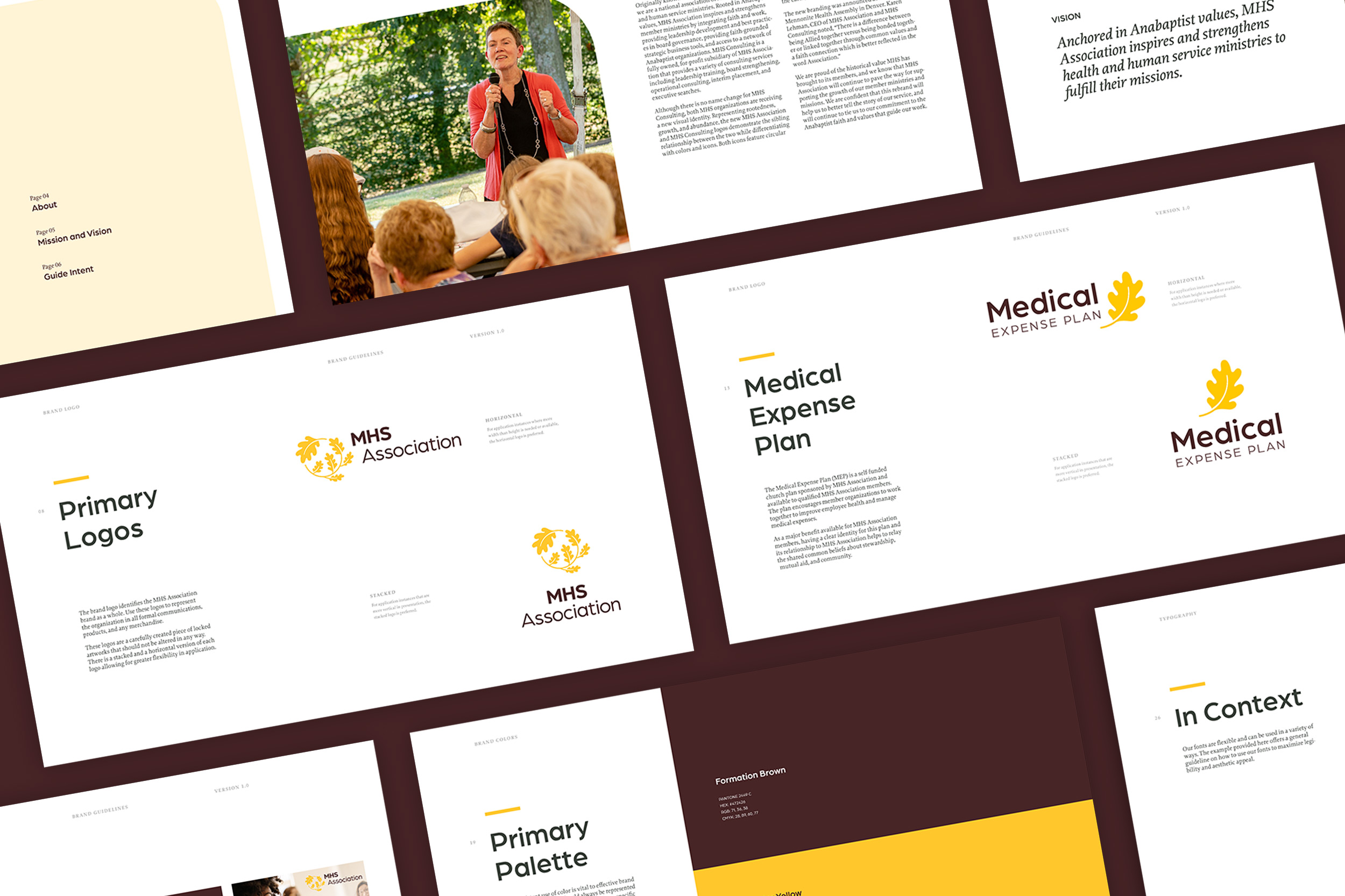
With the rebrand, the organization made the strategic decision to more clearly delineate the work of its two main branches. After a thorough renaming process, MHS Alliance ultimately became MHS Association, better reflecting the membership model. MHS Consulting continues to provide services to both MHS Association members and non-member organizations, while gaining greater visibility as a subsidiary of MHS Association.
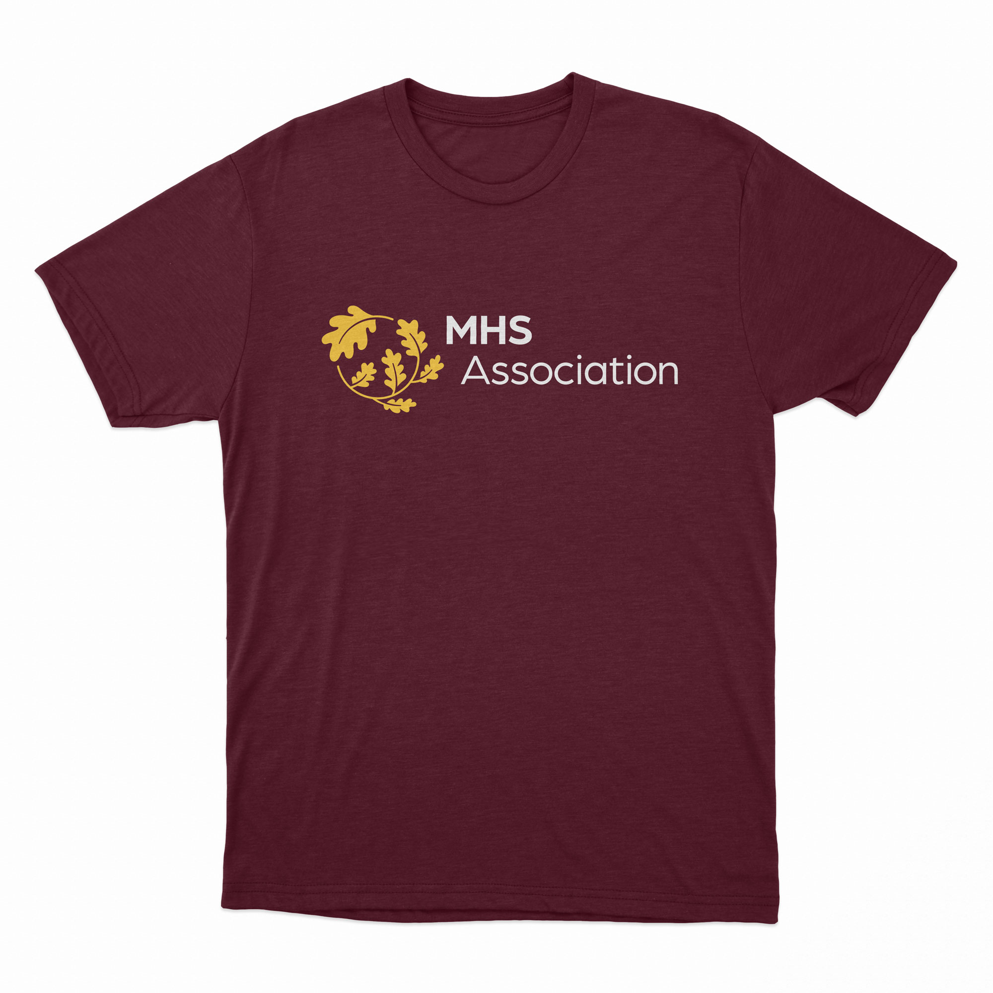
With this new visual identity, the organization as a whole leans further in the botanical theme, emphasizing the importance of rootedness, growth, and abundance. The complementary logos demonstrate both the distinction and familial relationship between MHS Association and MHS Consulting. Both icons have a circular form, alluding to wholeness in community. A unified color palette also draws on nature and celebrates creation: a deep, earthy brown; the bright yellow of the sun, vibrant green of vegetation and blues of the sea and sky. All the while, both branches remain committed to the integration of faith and values into the work they do in serving their constituent organizations.
BEFORE
AFTER
Early brandmark explorations
MHS Consulting
MHS Consulting is a fully owned, for-profit subsidiary of MHS Association that provides a variety of consulting services. Above all, they offer a faith-inspired approach to addressing organizational needs. All of their consultants have practical leadership experience and their experienced team offers leadership training, board strengthening, operational consulting, interim leadership, and executive searches.
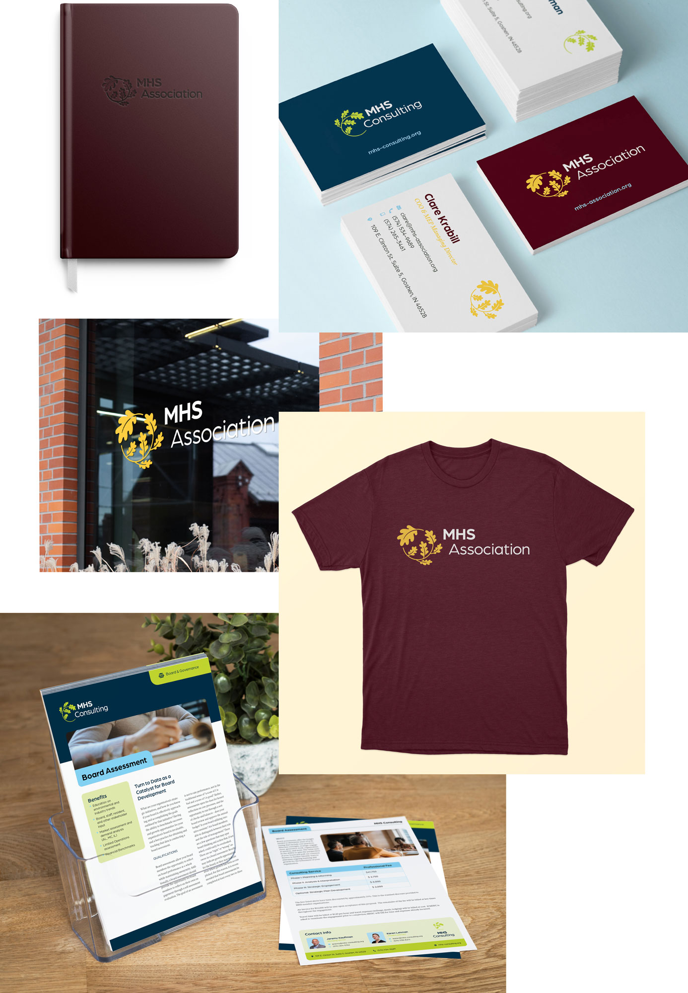
As related but separate organizations, we sought to visually tie the two organizations together, while simultaneously instilling some unique visual characteristics.
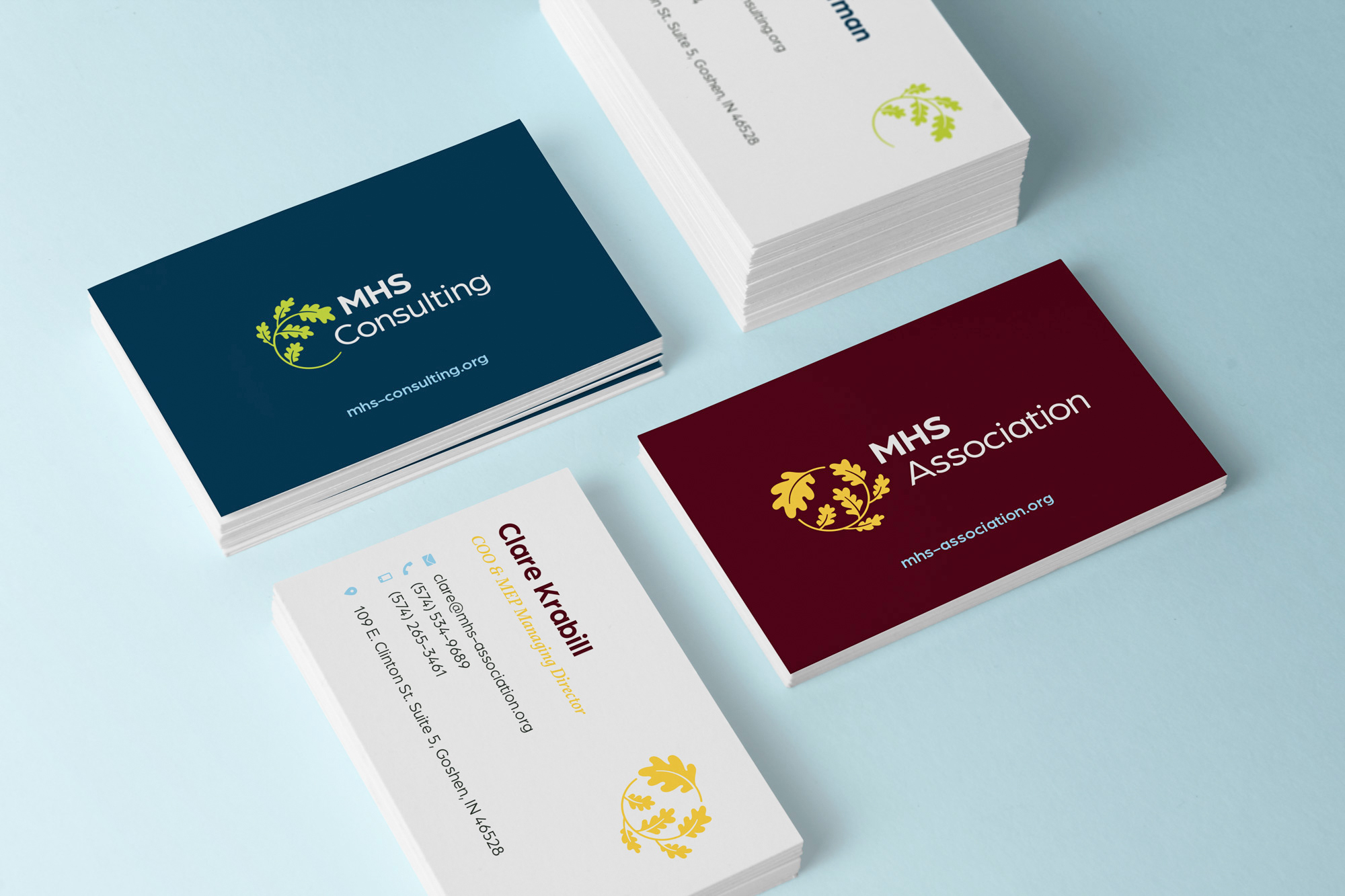


Clare Krabill, COO & MEP Managing Director
Outcomes
Throughout its long and varied history, the organization as whole has been grounded in the values of Jesus, and committed to integrating these values into the growth and development of its member organizations and non-member customers. With this rebrand, the values of rootedness, growth, and abundance carry on as the organization continues to grow, evolve and hone its mission. MHS Association and MHS Consulting can now do this with greater clarity of identity and purpose.
Credits
Creative & Art Direction
Rafael Barahona
Jordan Kauffman
Abby Graber
Designers
Abby Graber
Jessica Isch
Motion Design
Jessica Isch
Website
Alex Dugger
Jordan Kauffman
Abby Graber
Edgar Medina
